Heat map using Tailwind + Shadcn
A reusable React heatmap calendar built with shadcn/ui and ailwind CSS. Visualize daily activity, fitness data, business metrics, IoT events, or learning progress with a GitHub-style heatmap.

Project overview
Why I Built This
Heatmaps are a great way to visualize daily activity intensity over time.
GitHub popularized this pattern for commit activity, but in practice, it’s useful far beyond code:
- fitness tracking
- business metrics
- customer support volume
- learning progress
- IoT / sensor events
When I looked for existing React heatmap solutions, I noticed a common pattern:
- most rely on heavy chart libraries
- many use SVG or canvas, which makes them harder to theme
- customization often requires digging deep into library internals
For simple day-by-day intensity data, this felt like overkill.
So I decided to build a lightweight, copy-paste friendly heatmap calendar that follows the shadcn/ui philosophy:
copy the component → own the code → customize freely
Design Goals
Before writing any code, I defined a few clear goals:
1. No charting libraries
I wanted:
- minimal bundle size
- predictable styling
- no dependency lock-in
Everything is built with:
- regular React components
- CSS Grid / Flexbox
- Tailwind utility classes
2. Copy-paste over npm
Instead of publishing a black-box npm package, the component is designed to be:
- copied directly into a project
- fully owned by the developer
- easy to modify without fighting abstractions
This mirrors how shadcn/ui components work.
3. Domain-agnostic data model
The component should not care whether a value represents:
- commits
- minutes
- orders
- tickets
- eventsCore Architecture
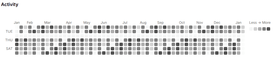
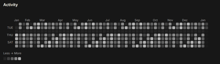
Calendar-based grid
The heatmap renders data as:
- columns → weeks
- rows → weekdays
- cells → individual dates
This matches how GitHub’s heatmap works and makes time-based scanning intuitive.
Internally:
- the date range is normalized
- missing days are filled
- duplicate dates are merged by summing values
Intensity levels
Instead of continuous color scales, the component uses discrete intensity levels.
This has a few benefits:
- more readable at small cell sizes
- easier theming
- predictable contrast in dark mode
Developers can override:
- Tailwind class names
- or provide a custom color palette
Axis Labels (Months & Weekdays)
One missing feature in many heatmap implementations is clear axis labeling.
This component includes:
- month labels on the top axis
- weekday labels on the left axis
Both are fully configurable or can be disabled entirely.
This makes the heatmap understandable at a glance, especially for non-technical users.
Tooltips & Interaction
Each cell supports:
- hover tooltips
- click handlers
- custom tooltip rendering
This allows the heatmap to act not just as a visualization, but as an interactive control in dashboards.
For example:
- clicking a day can open a detail panel
- tooltips can show formatted domain-specific information
Styling & Theming
Light & dark mode
The component relies on semantic Tailwind colors, so it automatically adapts to light and dark themes.
No extra logic is required.
Theme presets
I also added an optional theme preset picker, inspired by the shadcn theme page.
It allows users to:
- preview different heatmap color schemes
- copy CSS variables
- integrate the theme directly into their design system
This makes the component feel like a natural part of a larger UI ecosystem.
Open Source & Community
The component is open source, and contributions are welcome.
I’m especially interested in:
- performance improvements
- new domain examples
- alternative intensity mappings
- matrix (row × column) heatmap mode
If you find it useful, a ⭐ on the repository helps a lot and motivates continued improvement.
Toolset